01 — YOUR LABEL, OUR SNACKS

From your idea to a print-ready label

You tell us which product you want, in which pack and for whom. We check that everything fits together — product, pack, label and logistics — and tell you what is possible. Quantities and delivery dates are confirmed after that check, never before.

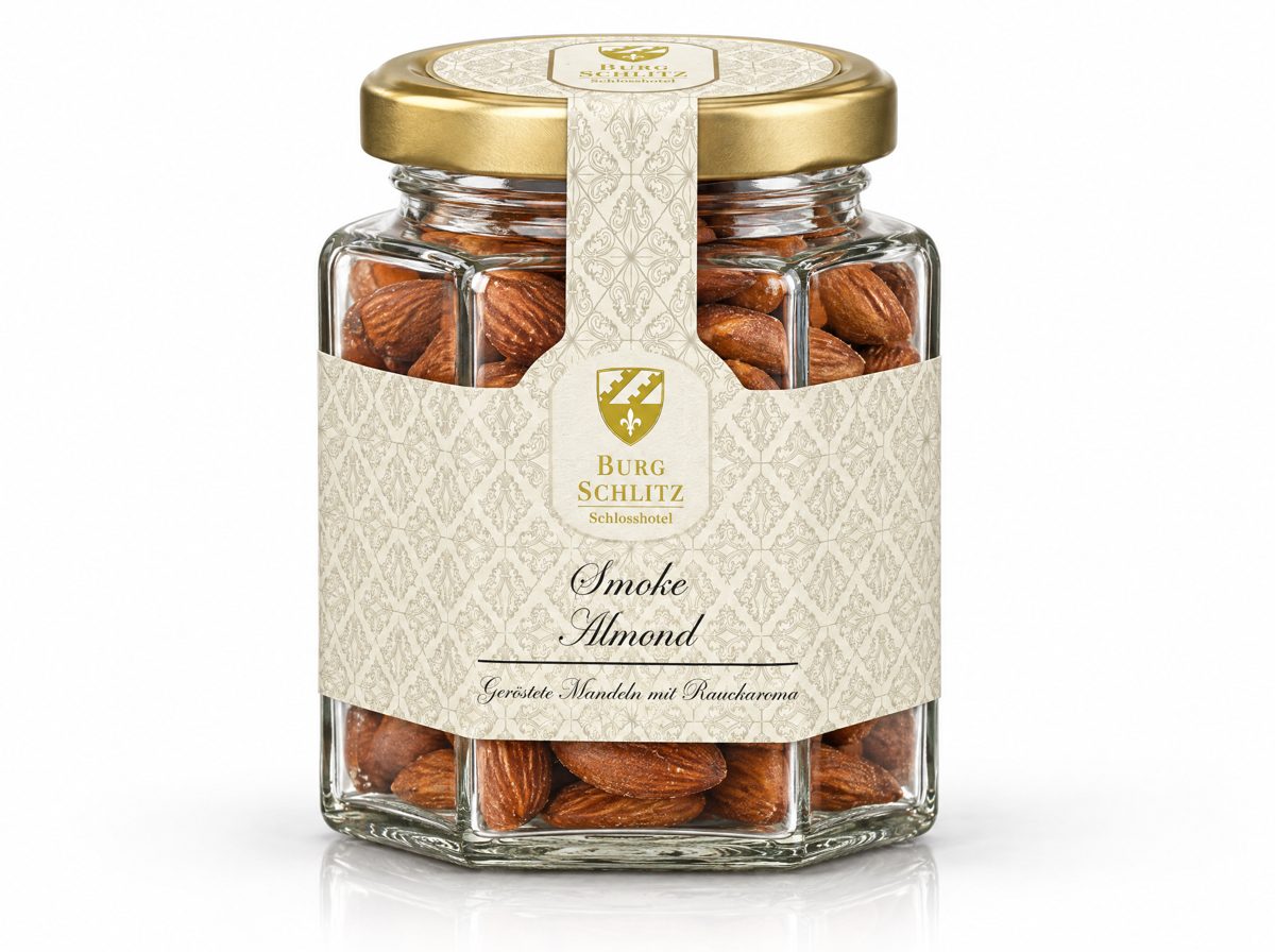
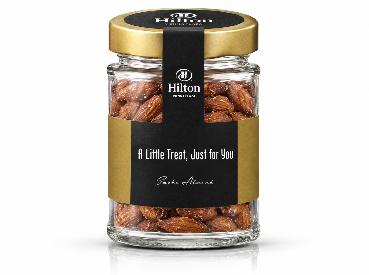
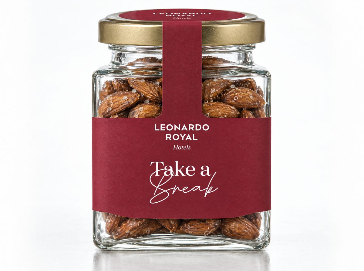
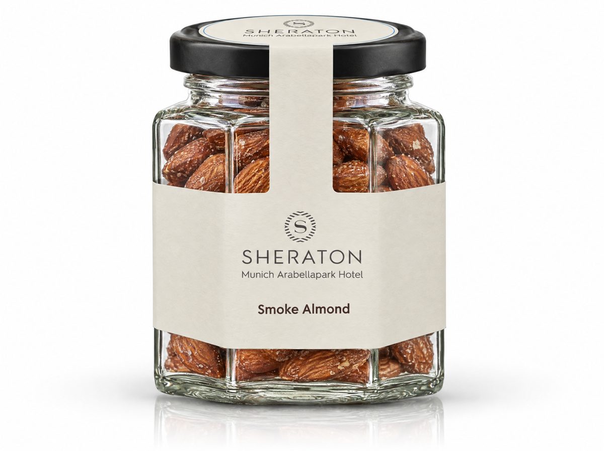
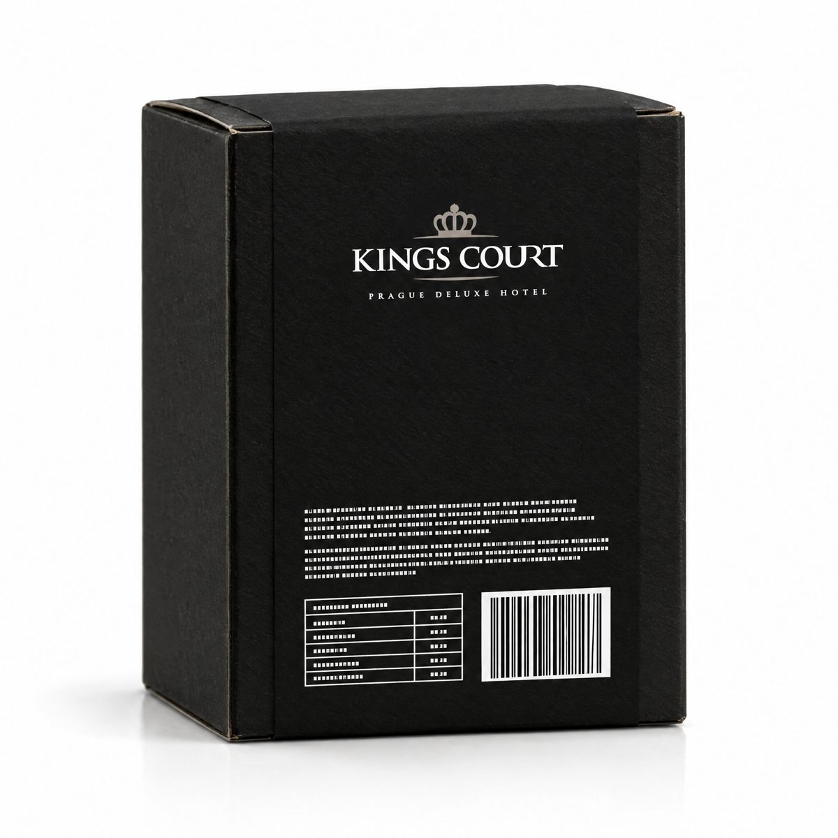
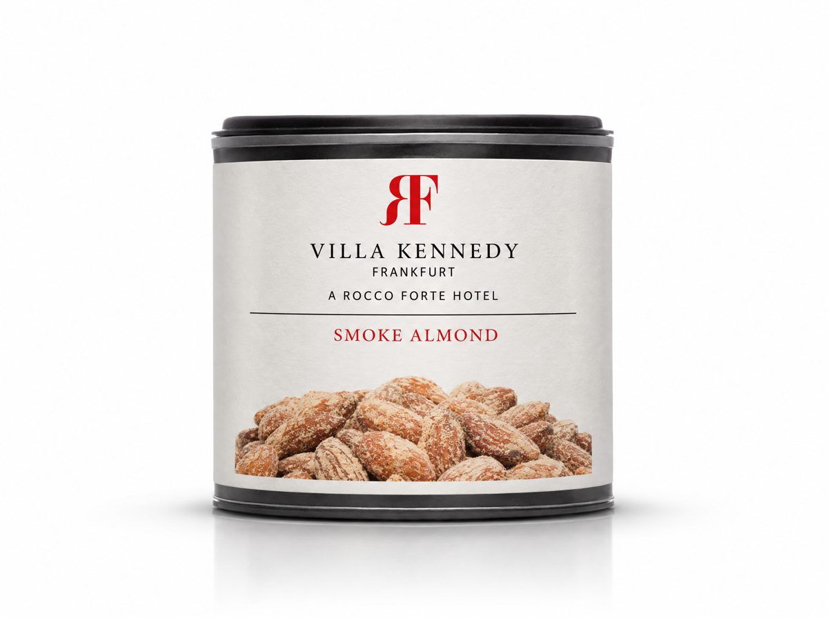
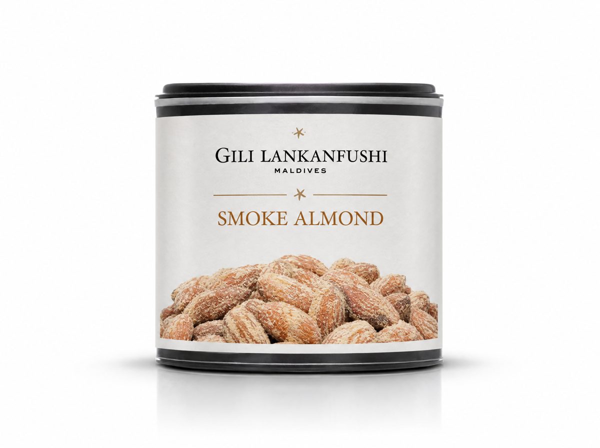
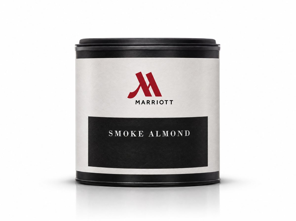
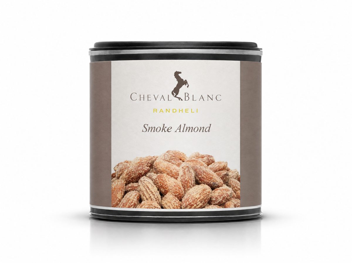
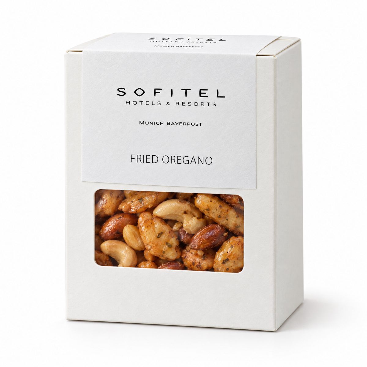
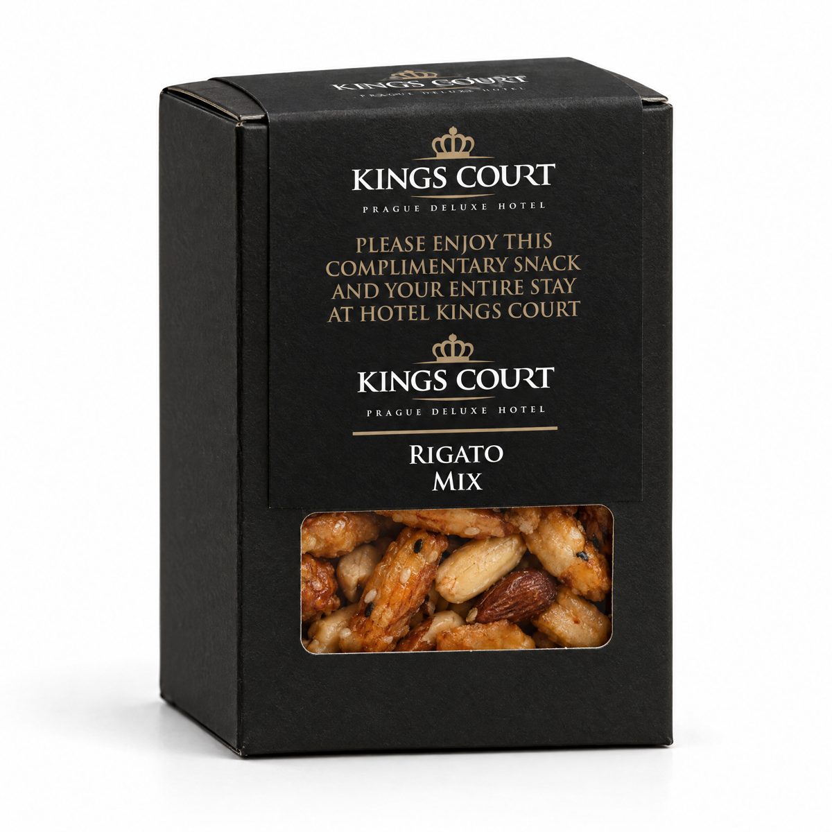
Hexagonal glass jar with a client label, gold lid Black folding carton with a client label band Black composite can with a client wrap-around label

Examples of completed projects · the brands shown belong to the clients · images generated with AI

02 — PRIVATE LABEL

Your brand on the label. We do the rest.

With private label, our snacks carry your name and your design. You decide how the label looks. We provide the product, the pack and the texts required by law. One simple rule: the mandatory information (ingredients, nutrition facts, barcode and so on) has a fixed place on the label and is always there. Everything else on the label is yours.

B2B prices and the eight pack formats of the assortment are available with your professional account.

03 — FORMATS

Three packs, three label shapes

We personalise three types of pack: the glass jar, the folding carton with window and the can. Each drawing shows two things: the fixed areas with the mandatory information (orange lines) and the creative zone — the part you design freely. Below each drawing you see real client projects on the actual pack.

GLE · GLR · GLQ

One label for all three glass jars

We have three glass jars: hexagonal GLE, round GLR and square GLQ. All three use the same label, so one design works for every jar.

  • The label has three parts: a circle on the lid, a vertical strip from the lid down the front (the tamper seal — it shows whether the jar has been opened) and a band around the jar.
  • Lid colours: GLE and GLQ in glossy black, matte black, silver or gold; GLR in glossy black, silver or gold.
  • Where the mandatory information goes: left and right of the band. Use a solid colour there — no photo or pattern — so the black or white text reads clearly.
  • A tip: do not place a logo that must be perfectly centred on the narrow strip; it can shift by a millimetre when applied.
  • Follow these points and your jar stays secure, readable and elegant.

Scroll horizontally on small screens to inspect the jar details.

Three-part label structure for GLE, GLR and GLQ jars
The label drawing: lid circle at the top, tamper strip in the middle, band at the bottom. Orange lines mark the mandatory information.
Hexagonal jar GLE with three-part client label, gold lid
GLE · gold lid
Round jar GLR with client label, gold lid
GLR · gold lid
Square jar GLQ with client label, gold lid
GLQ · gold lid
Hexagonal jar GLE with client label, black lid
GLE · black lid

Examples of completed projects · the brands shown belong to the clients · images generated with AI

BOX

Folding carton with window — one band wraps the box

The BOX is a small cardboard box with a window at the front to see the snacks. It comes in white, black or kraft (natural brown card).

  • The label is one single band: it starts just above the window, runs up the front, over the top and covers the whole back.
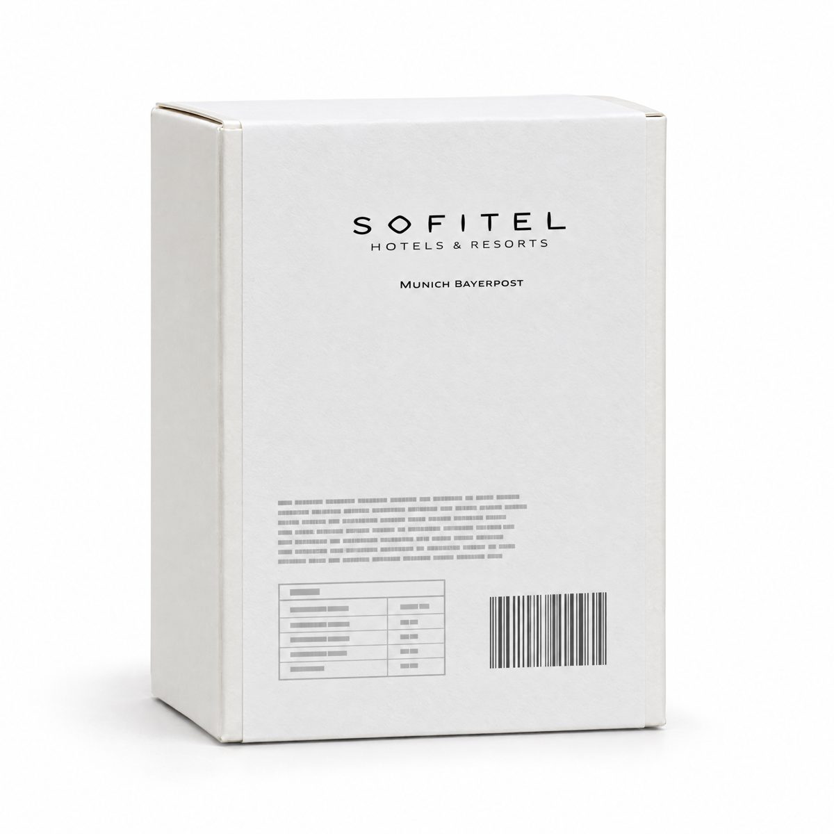
  • The mandatory information goes on the back only. The whole front is yours.
  • The back must be a solid colour. Our system prints the text there in black or white — whichever reads best on your colour.
  • With a good back colour the box stays readable, compliant and professional.
One-piece label strip structure for a folding carton with window
The band drawing: the back with the mandatory information at the top (shown upside down because the band folds over), the front — all yours — at the bottom.
White BOX with client label, front
White · front
White BOX, back with mandatory information panel
White · back with mandatory info
Black BOX with client label, front
Black · front
Black BOX, back with white mandatory information
Black · back, white text

Examples of completed projects · the brands shown belong to the clients · images generated with AI
CCS

Opaque can — one label wraps around it

The CCS can is made of rigid card, not transparent, in white or black. It is compact and has no window.

  • The mandatory information sits at the sides — far left and far right of the label. The whole centre is free for your design, top to bottom.
  • Use a solid colour at the sides so the black or white text reads without effort.
  • Because the contents are not visible, put a product photo on the front. We can send you high-resolution photos of our snacks on request.
  • That way the can is compliant, eye-catching and recognisably yours.
Wrap-around label structure for an opaque CCS composite can
The can label drawing: mandatory information left and right, the whole centre for your design.
White CCS can with client label and product photo
White · with product photo
White CCS can with client label
White
CCS can with client label and black panel
White label · black panel
White CCS can with client label, taupe band
White · taupe band

Examples of completed projects · the brands shown belong to the clients · images generated with AI
What we always print — and what you design

These eight items are required by law. We always place them in the same spot on the label, in black or white type — whichever reads best on your colour. You only need to leave a solid background there.

Font and position of the mandatory information are fixed. Everything else — colours, photos, logo, message — is your creative zone.

  1. Manufacturer who makes the snack
  2. Item number the product code
  3. Nutrition facts calories, fat, sugar…
  4. Bar code for the till and the scanner
  5. Dietary labels e.g. vegan, gluten-free
  6. Best before date until when it is at its best
  7. Ingredients with allergens highlighted
  8. Net weight how much snack is inside

04 — HOW WE WORK

Four steps to the first production run

  1. 1

    You tell us what you need

    Which country or market, which type of snack, which pack you prefer and where you will sell or give it away.

  2. 2

    We check that it is possible

    We review product, pack and label for your specific case and tell you what works and what does not.

  3. 3

    You give the go-ahead

    We show you the checked print files. Production starts only with your written confirmation.

  4. 4

    First production run

    We produce the first batch with the quantities and details we agreed together.

Quantities and delivery dates are confirmed after step 2, once we know everything is possible.

05 — YOUR DESIGN FILES

What we need to print your label well

If your designer or agency sends us the files like this, the print will look exactly as you see it on screen.

AI · EPS · SVGLogo and artwork as vector files — they can be enlarged without losing quality.
300 PPIIf you use photos, they need at least 300 pixels per inch at final size — otherwise they print blurred.
CMYKPhotos in CMYK colour mode, not RGB, so the printed colours match the screen.
2 mmKeep 2 mm clear of the cutting edge. Anything closer may be cut off.
OutlinesConvert all fonts to outlines (curves) so they print the same even if we do not have your font.

About colours: we print in CMYK. If your brand uses Pantone colours, we convert them automatically and a slight shade difference is possible. If you give us CMYK values directly, the result is the most accurate.

Ingredient languages: we have the ingredient texts in English, German, Spanish, Portuguese, Italian, French, Russian, Slovak, Danish, Polish and Dutch. Need another language? Just ask.

06 — CONTACT

To get started we only need five things

  1. 01Which country, which customers, and where will it be sold or given away? *
  2. 02Which type of snack and which pack do you prefer? *
  3. 03How many units do you have in mind, and by when?
  4. 04Do you already have a logo or design? Who owns the artwork? *
  5. 05Who is the contact person for the label and the final approval? *

Quantities and delivery dates are confirmed after we have checked that your project is possible.

Request the private label review